Although both are involved with the avian industry, they offer very different services: Animalzone specialises in the research and production of bird food, while the Bird Clinic (located on the same grounds as the Animalzone factory) is one of the few specialist avian veterinary practices in South Africa. The Animalzone brand has already been fairly well established, but it was high time for the Bird Clinic to also get a fresh and updated individual identity!
The Bird Clinic is well-respected and valued by many adoring bird owners, who confidently entrust their treasured pets to the excellent care of Dr de Beer and his competent staff. So the elements we chose to highlight with their brand included not only the medical expertise of the veterinary practice, but also the affectionate care with which the birds are nursed back to health... Clients of the clinic feel reassured to know that the Bird Clinic has “heart” for birds like they do. How do you like the final result?
The rationale from our design studio described the logo as:
“a versatile, iconic graphical development that personifies the character of parrots. The negative space ringneck and beak also resemble a surgeon’s mask. The symbol illustrates the typical behaviour of birds grooming. At the core of the design is a heart shape which illustrates the clinic’s loving attitude. The logo is intended to make you smile and bring out the vulnerability and cuteness of the avian pet and soften the blow of your sick bird.”
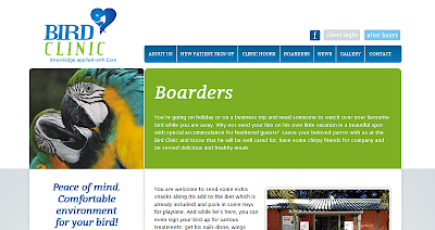
Similarly, the website has a clean, “clinical” look to reflect the sophistication and excellence of this medical facility. At the same time the bright colours and images remind us of the curious, chirpy patients themselves.
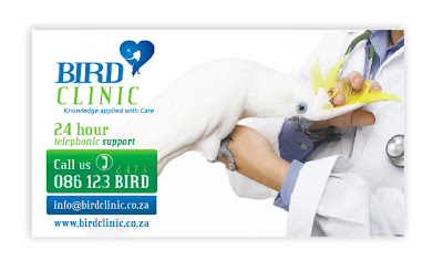
Have a look at the business cards and website screenshots below.
To see the full website go to: www.birdclinic.co.za


